Chapter 6 Visualization
6.1 Bar Chart
A bar chart draws a bar with a height proportional to the count in the table. The height could be given by the frequency or the proportion. The graph will look the same, but the scales may be different.
Suppose a group of 25 people are surveyed as to their beer-drinking preference. The categories were (1) Domestic can, (2) Domestic bottle, (3) Microbrew, and (4) import. The raw data is
3 4 1 1 3 4 3 3 1 3 2 1 2 1 2 3 2 3 1 1 1 1 4 3 1Let’s make a barplot of both frequencies and proportions. First, we use the scan function to read in the data:
then we plot a bar chart:
par(mfrow = c(1,3))
# This isn't correct
barplot(beer)
# Yes, call with summarized data
barplot(table(beer))
# Divide by n for proportion
barplot(table(beer) / length(beer)) 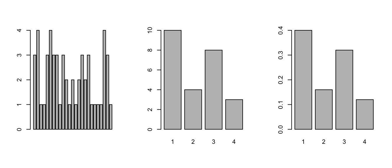
Figure 6.1: Bar chart examples
We did 3 barplots in Figure 6.1. The first to show that we don’t use
barplotwith the raw data.The second shows the use of the table command to create summarized data, and the result of this is sent to barplot creating the barplot of frequencies shown.
Finally, the command
## beer
##    1    2    3    4
## 0.40 0.16 0.32 0.12
produces the proportions first. We divide it by the number of data points, which is 25 or length(beer). The result is then handed off to barplot to make a graph. Notice it has the same shape as the previous one, but the height axis is now between 0 and 1 as it measures the proportion and not the frequency.
- This is ugly, you can change the color by specifying
col; see Figure 6.2.
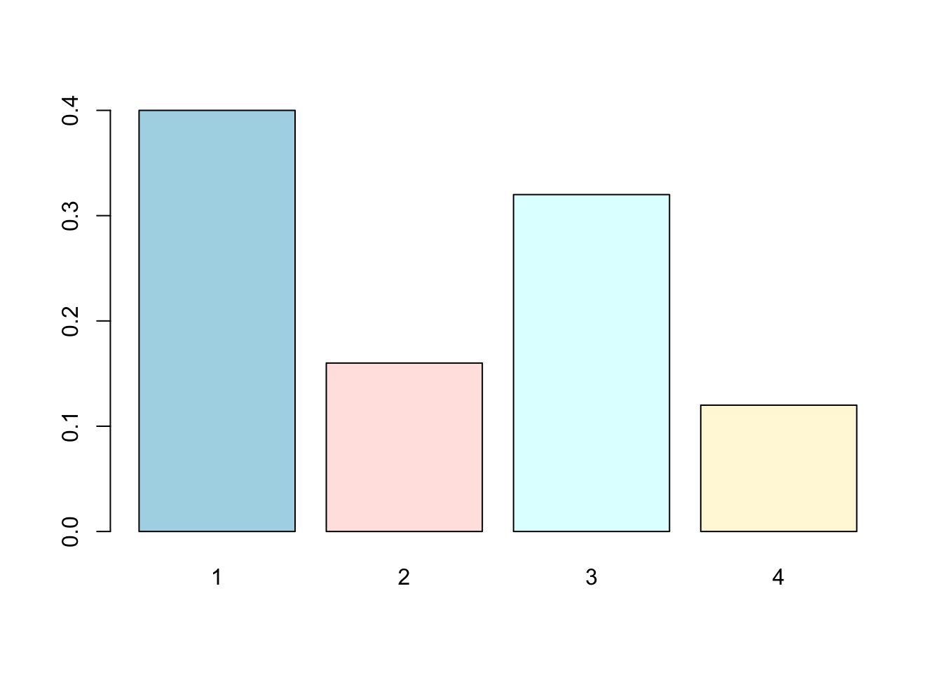
Figure 6.2: A colored bar chart example
6.2 Pie charts
The same data can be studied with pie charts using the pie function. Here are some simple examples illustrating the usage (similar to barplot(), but with some added features. See Figure 6.3.
par(mfrow = c(1,3))

# Store the table result
beer.counts <- table(beer)
# First pie -- kind of dull
pie(beer.counts)
# Give names
names(beer.counts) <- c("domestic\n can", "Domestic\n bottle",
                       "Microbrew", "Import")
# Prints out names
pie(beer.counts)
# Now with colors
pie(beer.counts, col = c("purple", "green2", "cyan", "white")) 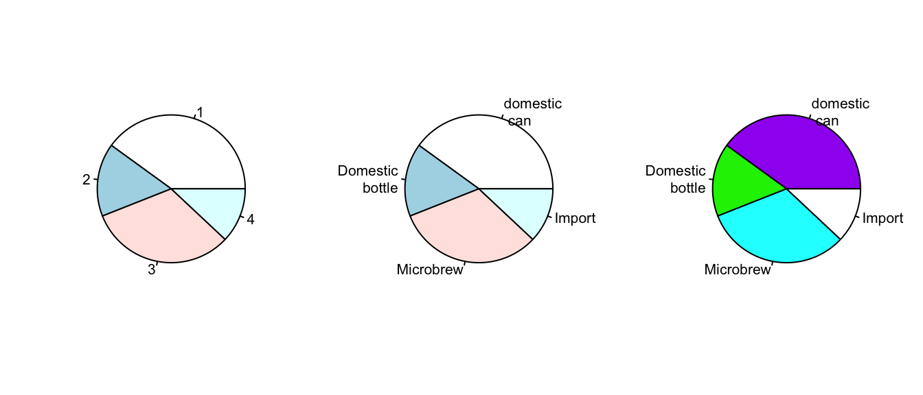
Figure 6.3: Pie chart plotting examples.
The first one was kind of boring, so we added names. This is done with the names(), which allows us to specify names to the categories. The resulting piechart shows how the names are used. Finally, we added color to the piechart. This is done by setting the piechart attribute col. We set this equal to a vector of color names that was the same length as our beer.counts. The help command (?pie) gives some examples for automatically getting different colors, notably using rainbow and gray.
Notice we used additional arguments to the function pie. The syntax for these is name=value. The ability to pass in named values to a function makes it easy to have fewer functions as each one can have more functionality.
6.3 Stem-and-leaf Charts
If the data set is relatively small, the stem-and-leaf diagram is handy for seeing the shape of the distribution and the values. The number on the left of the bar is the stem, the number on the right the digit. You put them together to find the observation.
Suppose you have the box score of a basketball game and find the following points per game for players on both teams:
2 3 16 23 14 12 4 13 2 0 0 0 6 28 31 14 4 8 2 5scores <- c(2, 3, 16, 23, 14, 12, 4, 13, 2, 0, 0, 0, 6, 28, 31,
14, 4, 8, 2, 5)
# What exactly is the name?
apropos("stem")## [1] "R_system_version" "stem" "system"
## [4] "system.file" "system.time" "system2"To create a stem and leaf chart is simple:
##
##   The decimal point is 1 digit(s) to the right of the |
##
##   0 | 000222344568
##   1 | 23446
##   2 | 38
##   3 | 1
Notice we use apropos() to help find the name for the function. It is stem() and not stemleaf(). The apropos() command is convenient when you think you know the function’s name but aren’t sure.
Suppose we wanted to break up the categories into groups of 5. We can do so by setting the “scale”
##
##   The decimal point is 1 digit(s) to the right of the |
##
##   0 | 000222344
##   0 | 568
##   1 | 2344
##   1 | 6
##   2 | 3
##   2 | 8
##   3 | 1
6.4 Histograms
If there is too much data, or your audience doesn’t know how to read the stem-and-leaf, you might try other summaries. The most common is similar to the bar plot and is a histogram. The histogram defines a sequence of breaks and then counts the number of observations in the bins formed by the breaks. (This is identical to the features of the cut() function.) It plots these with a bar similar to the bar chart, but the bars are touching. The height can be the frequencies or proportions.
Let’s begin with a simple example. Suppose the top 25 ranked movies made the following gross receipts for a week 4
29.6 28.2 19.6 13.7 13.0 7.8 3.4 2.0 1.9 1.0 0.7 0.4 0.4 0.3
0.3 0.3 0.3 0.3 0.2 0.2 0.2 0.1 0.1 0.1 0.1 0.1
We now make some histograms:
x <- c(29.6, 28.2, 19.6, 13.7, 13.0, 7.8, 3.4, 2.0, 1.9, 1.0,
       0.7, 0.4, 0.4, 0.3, 0.3, 0.3, 0.3, 0.3, 0.2, 0.2, 0.2,
       0.1, 0.1, 0.1, 0.1, 0.1)
par(mfrow = c(1,2))
hist(x) # frequencies
hist(x, probability = TRUE) # proportions (or probabilities)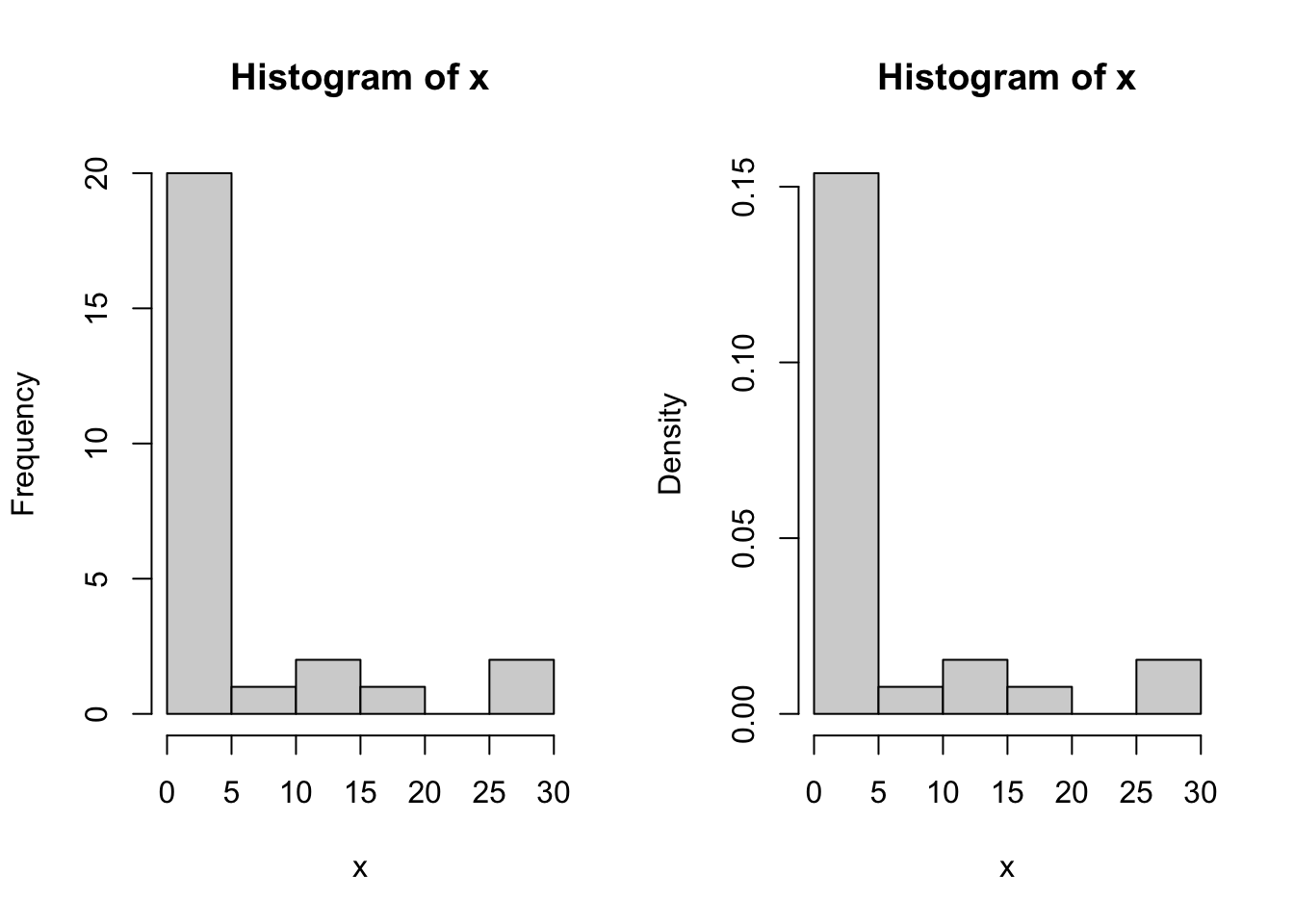
Figure 6.4: Examples of histogram.
Two graphs are shown in Figure 6.4. The first is the default graph which makes a histogram of frequencies (total counts). The second does a histogram of proportions which makes the total area add to 1. This is preferred as it relates better to the concept of a probability density. Note the only difference is the scale on the y axis.
The basic histogram has a predefined set of break points for the bins. If you want, you can specify the number of breaks or your own break points; see Figure 6.5.
par(mfrow = c(1, 2))
# Specify 10 breaks, or just hist(x, 10)
hist(x, breaks = 10)
# Specify break points
hist(x, breaks = c(0, 1, 2, 3, 4, 5, 10, 20, max(x)))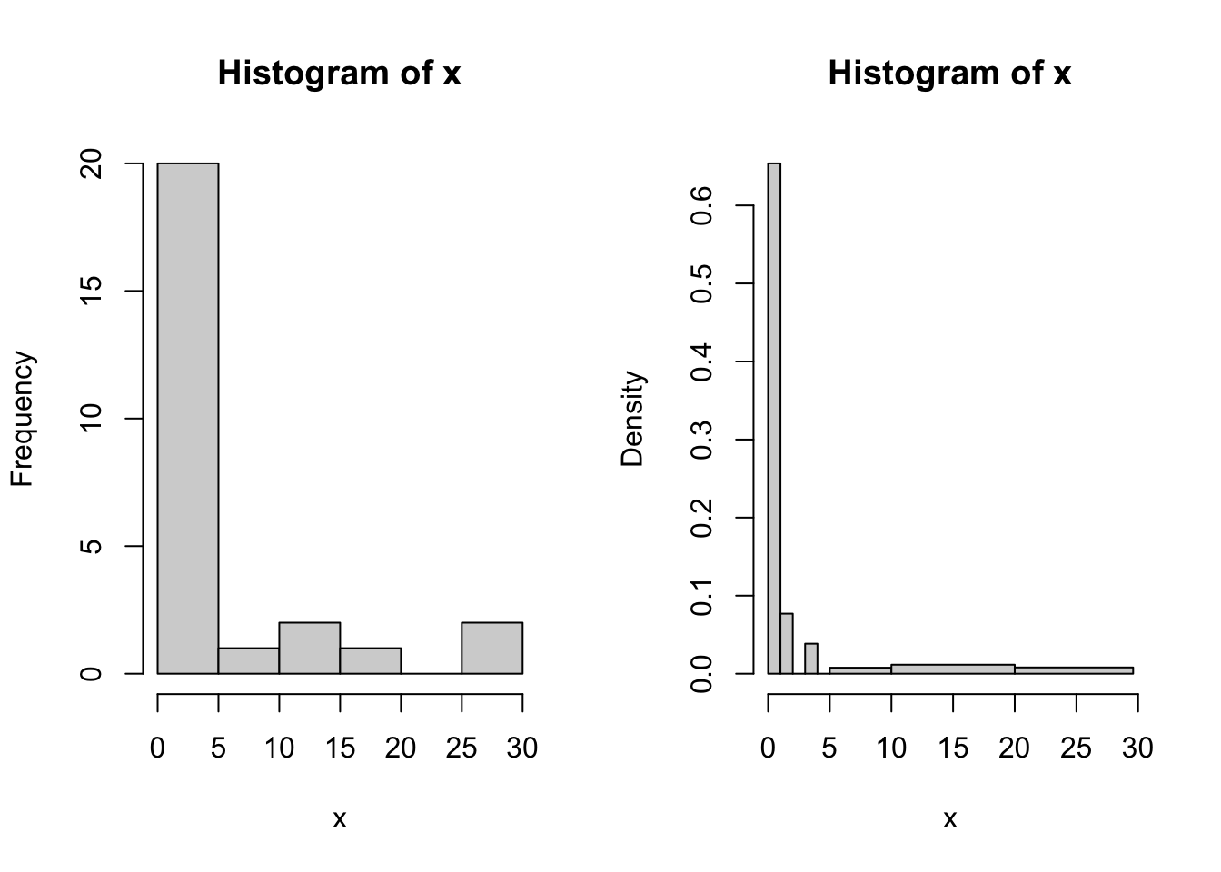
Figure 6.5: More examples of histogram.
6.5 Boxplot
The boxplot is used to summarize data succinctly, quickly displaying if the data is symmetric or has suspected outliers. It is based on the 5-number summary.
6.5.1 Boxplot: one sample
The basic function is boxplot()
Example: Suppose we have 11 observations:
7 9.5 10 11 10 10 8 11 18 13 11.5Figure 6.6 shows a basic boxplot.
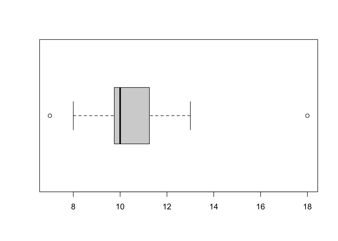
Figure 6.6: An example of boxplot.
We can add axis labels, a main title and color the box using simple commands; see Figure 6.7.
boxplot(x, xlab = "Single sample", ylab = "Value axis",
        main = "Simple Box plot", col = "lightblue")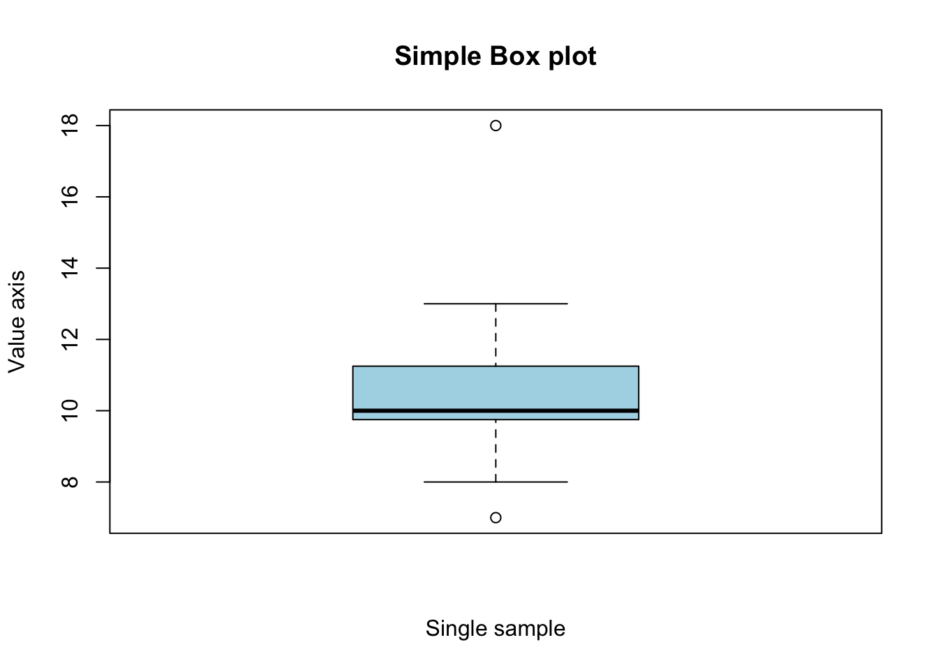
Figure 6.7: An example of boxplot with title and colored box.
6.5.2 Plotting several samples
So we can see how to represent a single sample but often we wish to compare samples. For example, we may have raised broods of flies on various sugars. We measure the size of the individual flies and record the diet for each. Our data file would consist of two columns; one for growth and one for sugar. For example,
growth	sugar
75	C
72	C
73	C
61	F
67	F
64	F
62	S
63	S
growth <- c(75, 72, 73, 61, 67, 64, 62, 63)
sugar <- c("C", "C", "C", "F", "F", "F", "S", "S")
fly <- data.frame(growth = growth, sugar = sugar)To plot these we use the boxplot command with slightly different syntax e.g. boxplot(y ~ x). This model syntax is used widely in R for setting-up regression analyses for example.
To create a summary boxplot in Figure 6.8 we type something like:
boxplot(growth ~ sugar, data = fly, xlab = "Sugar type",
        ylab = "Growth", col = "bisque", range = 0)
title(main = "Growth against sugar type", font.main = 4)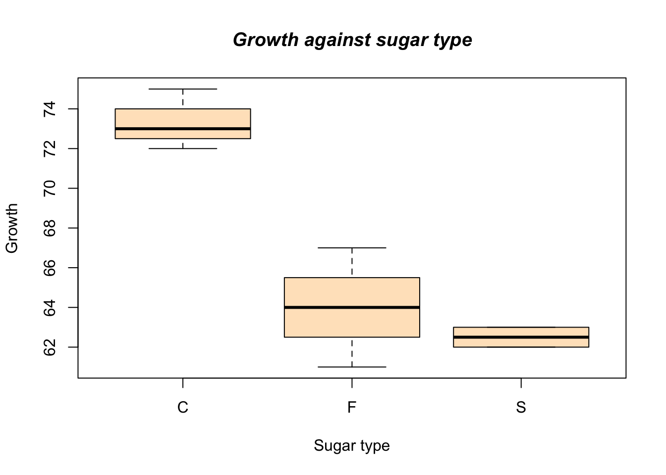
Figure 6.8: An example of side by side boxplot.
Now we can see that the different sugar treatments appear to produce differing growth in our subjects.
6.6 Scatterplot
Often we wish to investigate one numerical variable against another. For example the height of a father compared to their sons height.
6.6.1 Basic command
As usual with R there are many additional parameters that you can add to customize your plots. The basic command is:
where x is the name of your x-variable and y is the name of your y-variable. This is fine if you have two variables but if they are part of a bigger data set, then you can use command
Note the use of the model syntax. This model syntax is used widely in R for setting-up ANOVA and regression analyses for example (see also it’s use in the boxplot).
R comes with a number of data sets built-in; these are used in the examples and can be useful to ‘play with’. For example, the data set cars contains two variables speed and dist. To see a basic scatter plot like Figure 6.9 try the following:
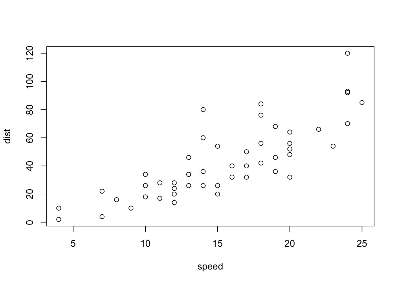
Figure 6.9: A simple example of scatterplot.
This basic scatterplot takes the axes labels from the variables and uses open circles as the plotting symbol.
Additional commands with regression fit
As usual with R we have a wealth of additional commands at our disposal to beef up the display. A useful additional command is to add a line of best-fit. This is a command that adds to the current plot (like the title() command). For the above example we’d type:
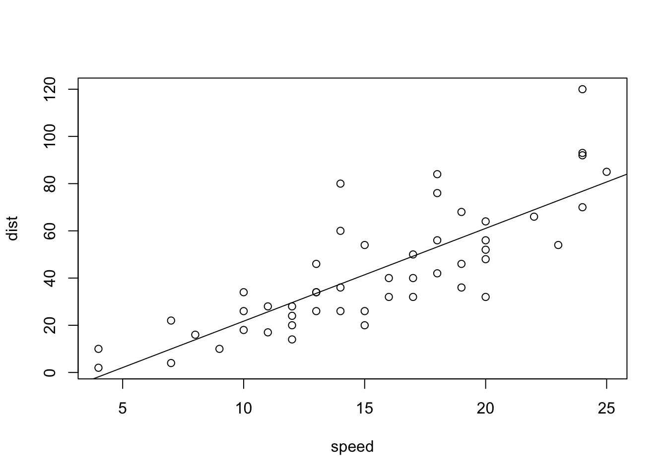
Figure 6.10: A scatterplot with fitted regression line.
The basic command uses abline(a, b), where a=slope and b=intercept. Here we use a linear model command to calculate the best-fit equation for us (try typing the lm() command separately, you get the intercept and slope) as shown in Figure 6.10.
If we combine this with a couple of extra lines we can produce a better looking plot in Figure 6.11:
plot(dist ~ speed, data = cars, xlab = "Speed",
     ylab = "Distance", col = "blue")
title(main = "Scatter plot with best-fit line", font.main= 4)
abline(lm(dist ~ speed, data = cars), col = "red")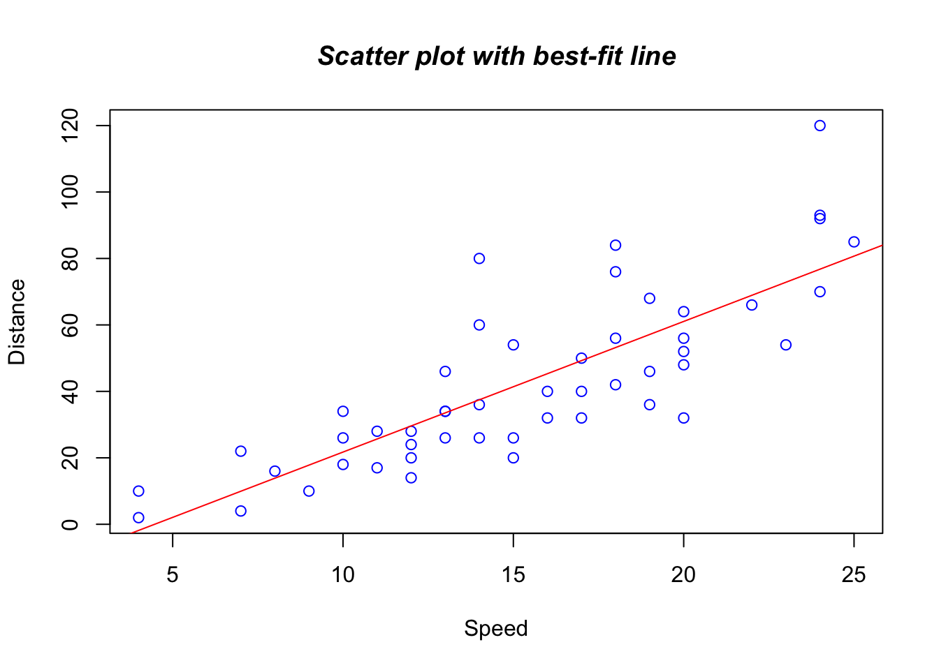
Figure 6.11: A better-looking scatterplot with fitted regression line.
This illustrates several of the additional commands. We have set the axis labels and the color of the plotting symbols. Next we added a main title and set the font to bold italic (try other values). Finally we set the best-fit line and made it red.
6.6.2 More useful commands
We can alter the plotting symbol using the command pch=n, where n is a simple number. We can also alter the range of the x and y axes using xlim=c(lower, upper) and ylim=c(lower, upper). The size of the plotted points is manipulated using the cex=n command, where `n= the magnification’ factor. Here are some commands that illustrate these parameters:
plot(dist ~ speed, data = cars, pch = 19, xlim = c(0,25),
     ylim = c(-20, 120), cex = 2)
abline(lm(dist ~ speed, data = cars))
title(main = "Scatterplot with altered y-axis and larger symbols")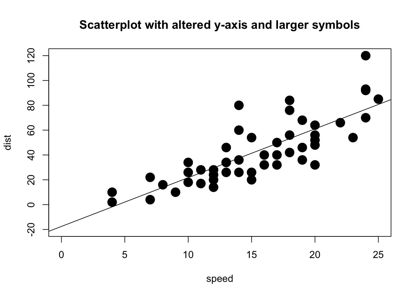
Figure 6.12: A scatterplot with fitted regression line and larger symbols.
In Figure 6.12 the plotting symbol is set to 19 (a solid circle) and expanded by a factor of 2. Both x and y axes have been rescaled. The labels on the axes have been left blank and default to the name of the variable (which is taken from the data set).
6.6.3 An example with multiple symbols
You have a data set called blood.txt which includes the variables Subject, Gender, AgeGroup, RBC (red blood cells), WBC (white blood cells) and Chol (Cholesterol). This data set has already been provided. Figure 6.13 shows a better-looking example with multiple symbols
# Read the dataset
blood <- read.table("data/blood.txt", sep = "", na.strings = ".",
                    colClasses = c("character", "character",
                                   "character", "character",
                                 "double", "double", "double"),)

# Assign the names to the above dataset
names(blood) <- c("Subject", "Gender", "BloodType", "AgeGroup",
               "WBC", "RBC", "Chol")

# Draw a scatterplot
plot(blood$WBC, blood$RBC, xlab = "WBC", ylab = "RBC",
     col = 1:4, pch = 1:4, ylim = c(2,9))

# Provide a legend
legend("topleft", c("A", "AB", "B", "O"), pch = 1:4, col = 1:4)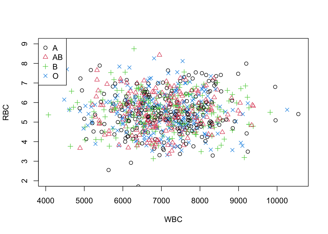
Figure 6.13: A scatterplot with multiple symbols and legend.
Note: This function legend() can be used to add legends to plots. Look at help for details.
6.7 Line plots and Time series plots
Previously we learned about bar charts (including histograms), pie charts, boxplots and scatter plots. However, there may be occasions when we wish to display data as a line, perhaps to show a time series. There is no specific line plot command in R so we must use other graph types and coerce the program to produce our line.
6.7.1 Plot types
If we produce a plot we generally get a series of points. The default symbol for the points is an open circle but we can alter it using the pch=n parameter (see the section on scatter plots). Actually the points are only one sort of plot type that we can achieve in R (the default). We can use the parameter type = “type” to create other plots. Command Plot type
type = "p"	Produces points.
type = "l"	Produces line segments.
type = "b"	Produces points joined by line segments.
type = "o"	Similar to "b" but the points are overlaid onto the line.
type = "n"	Produces a graph with nothing it it! This can be used to create a graph frame that you add lines to later.
So for example we may type: plot(x, y, type = "b") to produce a simple line plot with added points.
6.7.2 Time Series
Consider the following data vostok, where we have mean monthly temperatures for an Antarctic research station.
 	month	temp
1	Jan	-32.0
2	Feb	-47.3
3	Mar	-57.2
4	Apr	-62.9
5	May	-61.0
6	Jun	-70.6
7	Jul	-65.5
8	Aug	-68.2
9	Sep	-63.2
10	Oct	-58.0
11	Nov	-42.0
12	Dec	-30.4
The file was read in using the standard read.table() command
so it contains two columns; month is a factor and temp is a numeric variable. If we attempt to plot the whole variable e.g. plot(temp ~ month) we get a horrid mess (try it and see). This is because the month is a factor and cannot be represented on an x, y scatter plot.
However, if we plot the temperature alone we get the beginnings of something sensible:
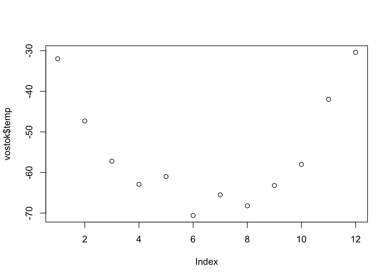
Figure 6.14: A plot the temperature alone.
Figure 6.14 appears to be a series of points and they are in the correct order. We can easily join the dots to make a line plot by adding (type="b") to the plot command (see the section on plot types). Notice how R have used default labels for the axes, temp for the y-axis is taken from the values in the variable but index is used for the x-axis because we have no reference (we only plotted a single variable).
What we need to do next is to alter the x-axis to reflect our month variable.
Custom axes
When we look at the time series plot produced above we see that the x-axis needs a bit of work. Since the plot was made from a single variable (temp) there are no values for x and R substitutes a numeric index.
We need to scrap the current axes and start again with our own. It is simple to produce a plot with no axes, merely add (axes=F) to the plot command; see 6.15 below.
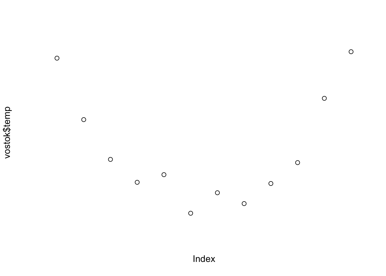
Figure 6.15: A plot the temperature without of axes.
However, R appends default labels to the axes so we need to get rid of those too:
Figure 6.16: A plot the temperature without of axes or labels.
That does the job; see Figure 6.16. We are going to add axis labels of course so could have specified them now but I use the "" double (double) quotes to illustrate how to produce blank ones (setting xlab= F produces a label FALSE so we have to use "").
To add an axis we use the axis() command. Axis 1 is the bottom of the plot (i.e. the x-axis), axis 2 is the left side of the plot (the y-axis). We can also specify the top (3) and the right side (4) if we wish. In it’s simplest form axis(n) adds in the axis specified with it’s default parameters. This won’t do here because the default x-axis contains only index information. We need to tell R where to find the labels associated with the axis.
To generate an axis we need to specify the length of it and the labels to be used. Figure 6.17 is what we need for our temperature example:
plot(vostok$temp, axes = F, xlab = "", ylab = "")
axis(1, at = 1:length(vostok$temp), labels = vostok$month)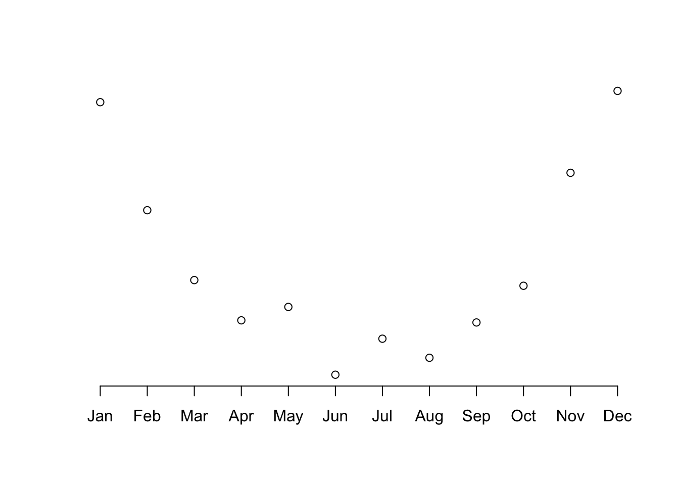
Figure 6.17: A plot of temperature. with time x-axis.
Now we need to add in the y-axis and the axis labels. We could also add a title and perhaps the whole thing would look better if the dots were joined up to make a lineplot (which was after all the point of the exercise). Here is the whole series of commands from start to finish. Figure 6.18 shows the final time series plot.
plot(vostok$temp, axes = F, xlab = "", ylab = "", type = "b")
axis(1, at = 1:length(vostok$temp), labels = vostok$month)
axis(2)
title(main = "Time Series", font.main = 4, xlab = "Month", ylab = "Mean Temp C")
box() #adds a border around the plot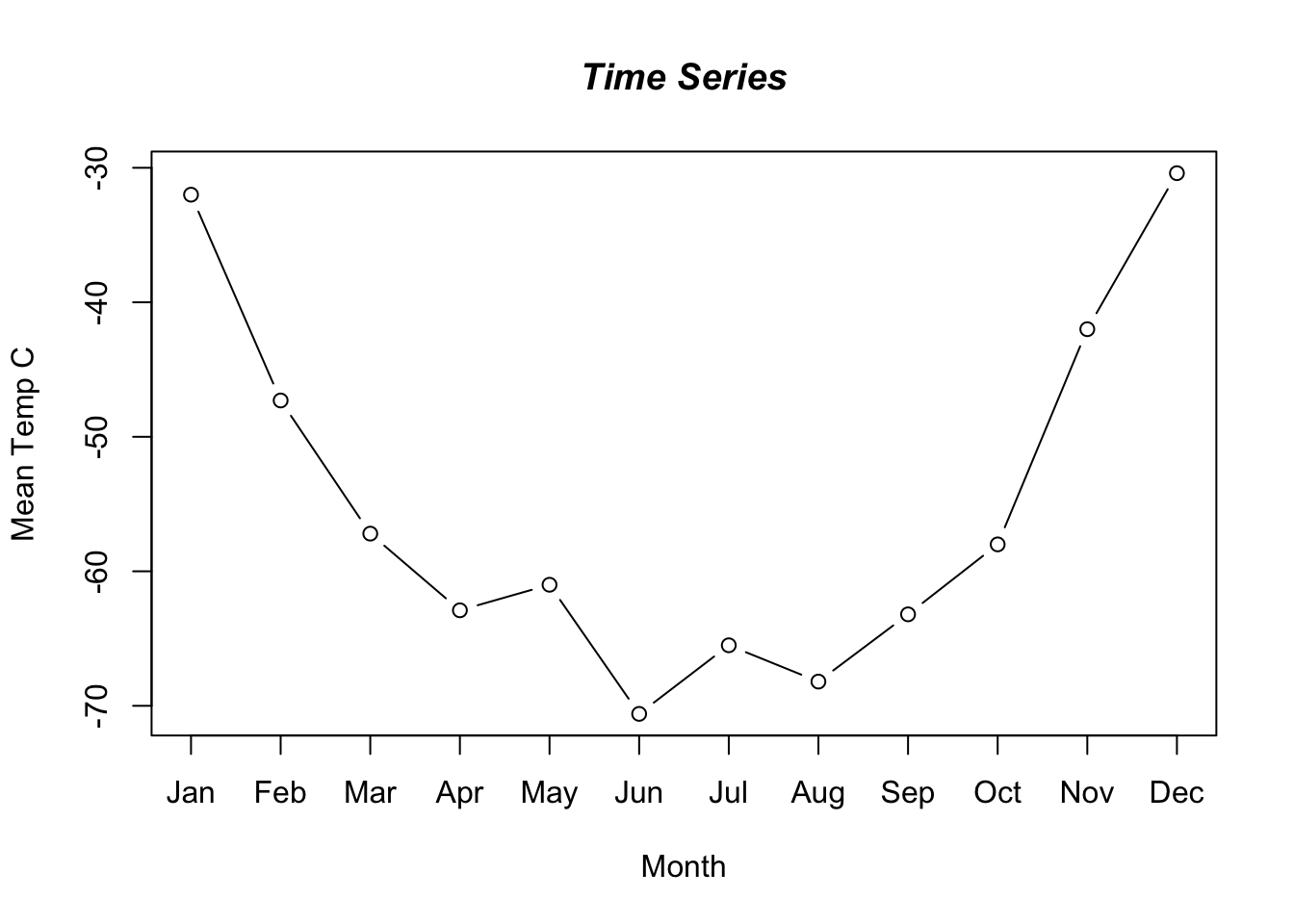
Figure 6.18: A time series plot of temperature.
6.8 Visualization using ggplot2
The package we will use to create visualizations is ggplot2. It allows for more sophisticated visualization as one progresses. ggplot2 allows for visualization using layers and addition of different commands that are useful in continuing to build and modify a visual representation.
The typical syntax for creating a visualization specifies the dataset to be used, aesthetics of mapping that specifies the variable, and the type of chart such as barchart or a scatterplot etc to be used.
6.8.1 Scatter plots
Simple scatterplots can be created using the R code below. The color, the size and the shape of points can be changed using the function geom_point() as follows:
library(ggplot2)
# Read the data
blood <- read.table("data/blood.txt", sep = "", na.strings = ".",
                    colClasses = c("character","character",
                                   "character","character",
                                   "double","double","double"),)
# Assign the names to the above dataset
names(blood) <- c("Subject", "Gender", "BloodType", "AgeGroup",
               "WBC", "RBC", "Chol")
blood$BloodType <- as.factor(blood$BloodType)
# Change point shapes by the levels of cyl
ggplot(blood, aes(x = WBC, y = RBC, shape = BloodType)) +
  geom_point()
## Warning: Removed 167 rows containing missing values
## (geom_point).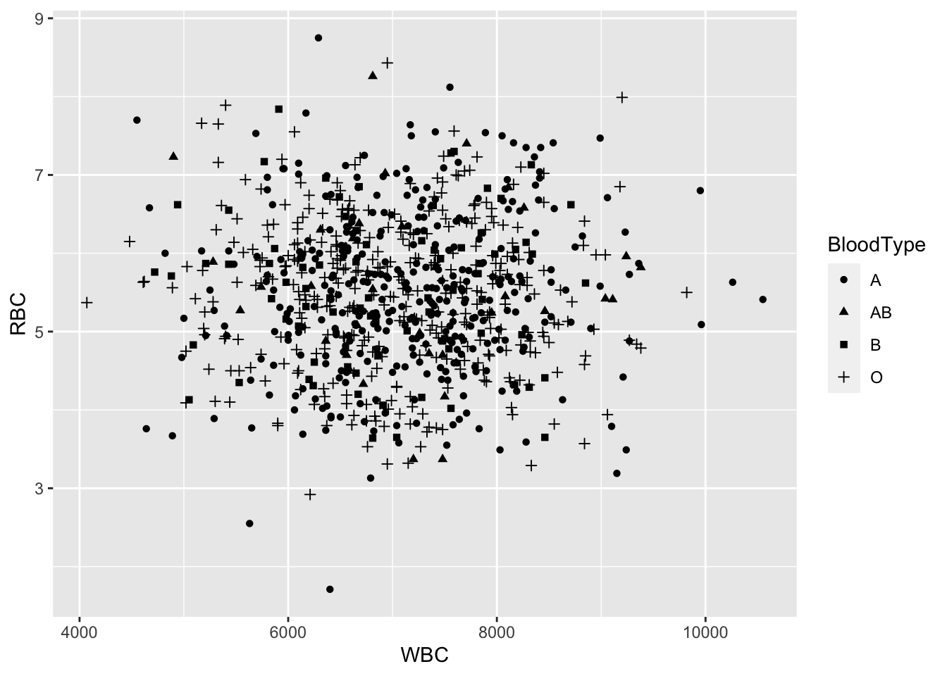
Figure 6.19: A scatterplot based on ggplot2.
# Change point shapes and colors
ggplot(blood, aes(x = WBC, y = RBC, shape = BloodType,
                  color = BloodType)) +
  geom_point()
## Warning: Removed 167 rows containing missing values
## (geom_point).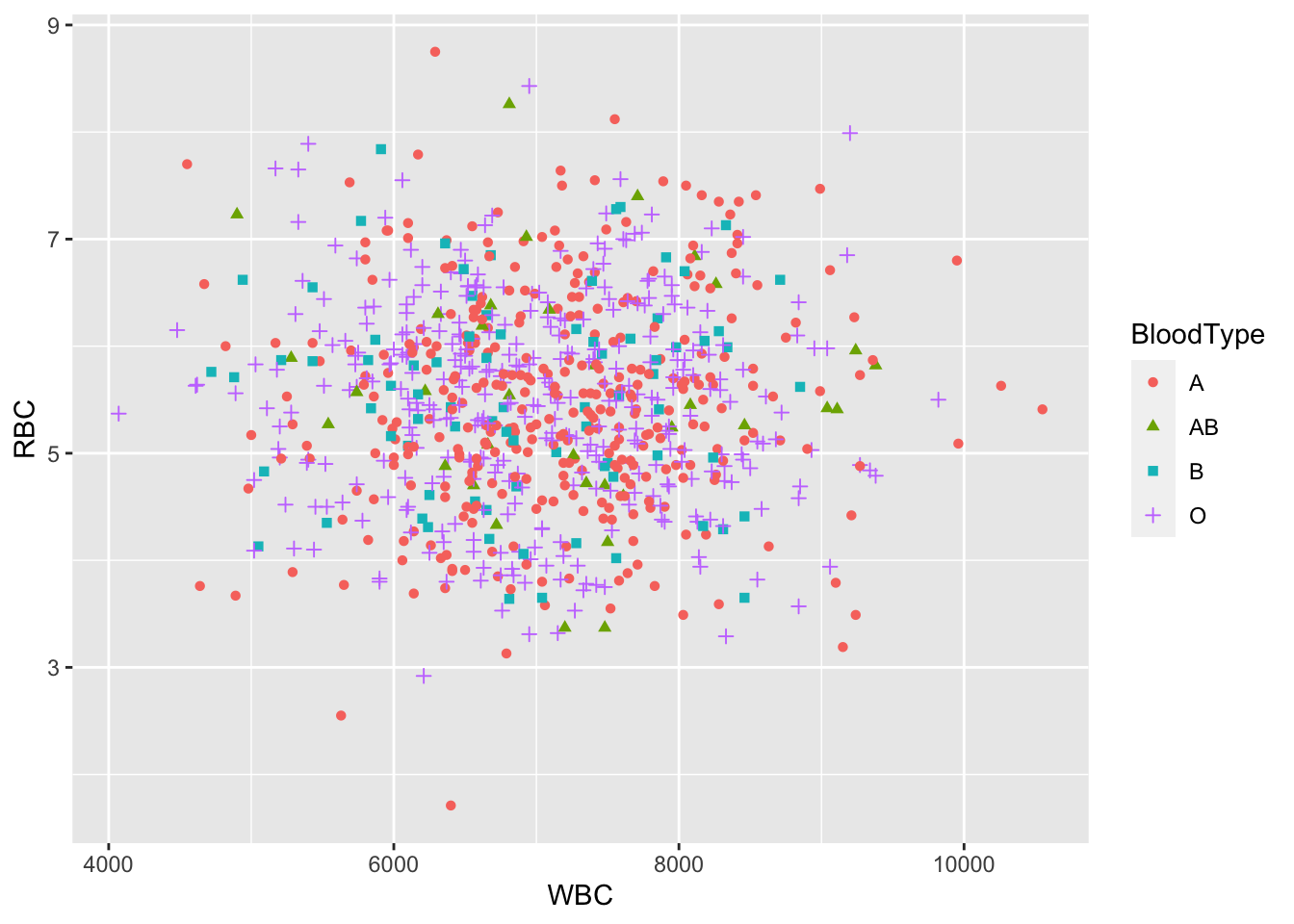
Figure 6.20: A scatterplot based on ggplot2.
# Change point shapes, colors and size
ggplot(blood, aes(x = WBC, y = RBC, shape = BloodType,
                  color = BloodType, size = Chol)) +
  geom_point()
## Warning: Removed 337 rows containing missing values
## (geom_point).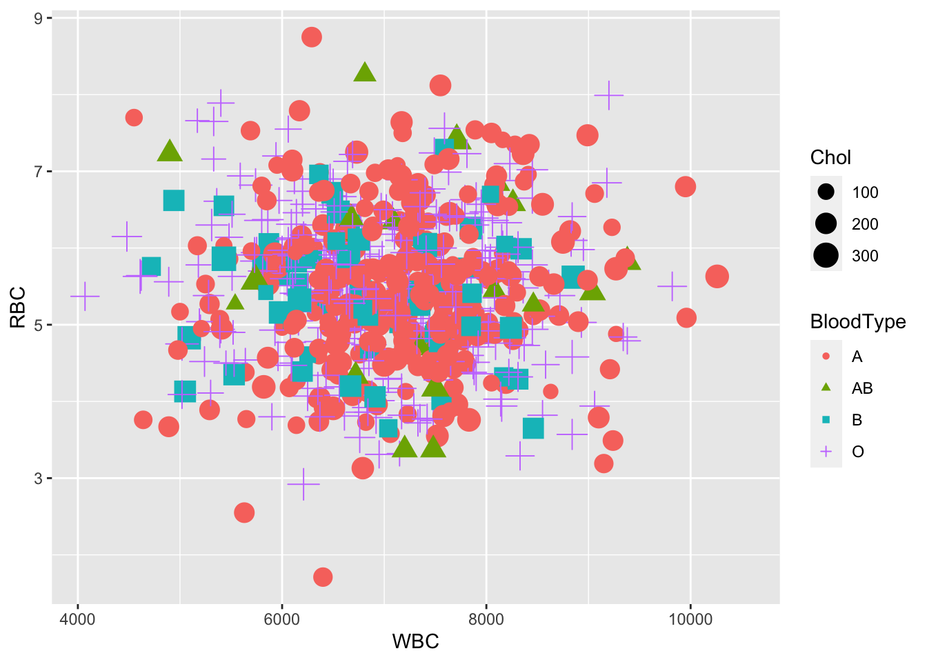
Figure 6.21: A scatterplot based on ggplot2.
6.8.2 Creating maps with ggplot2
We will learn how to make choropleth maps, sometimes called heat maps, using the ggplot2 package. A choropleth map is a map that shows a geographic landscape with units such as countries, states, or watersheds where each unit is colored according to a particular value.
# Read map and data
library(ggplot2)
library(maps)
# load United States state map data
MainStates <- map_data("state")
# read the state population data
StatePopulation <-
read.csv("https://raw.githubusercontent.com/ds4stats/r-tutorials/master/intro-maps/data/StatePopulation.csv", as.is = TRUE)- Your first map
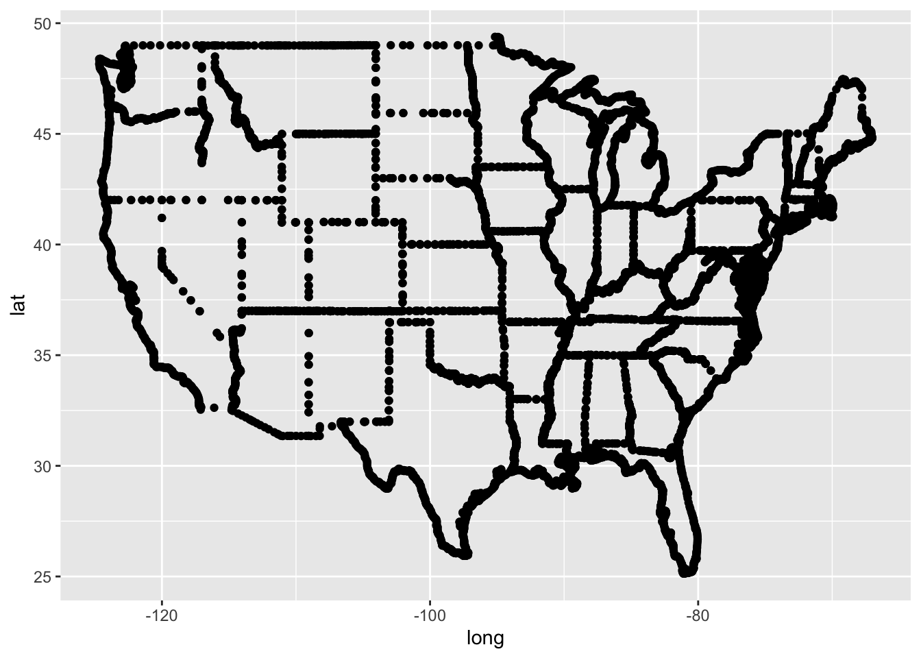
Figure 6.22: Your first map.
- Making a base map
#plot all states with ggplot2, using black borders and light blue fill
ggplot() +
  geom_polygon(data = MainStates,
               aes(x = long, y = lat, group = group),
                color = "black", fill = "lightblue")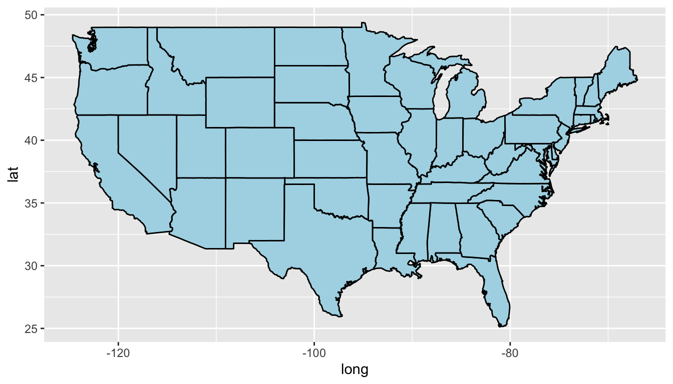
Figure 6.23: A base map.
- Customizing your choropleth map
Now that we have created a base map of the mainland states, we will color each state according to its population. The first step is to use the dplyr package to merge the MainStates and StatePopulation files.
# Use the dplyr package to merge MainStates and StatePopulation
library(dplyr)
MergedStates <- inner_join(MainStates, StatePopulation,
                           by = "region")
# Create a Choropleth map of the United States
p <- ggplot()
p <- p + geom_polygon(data = MergedStates,
aes(x = long, y = lat, group = group,
fill = population/1000000),
color = "white", size = 0.2)
p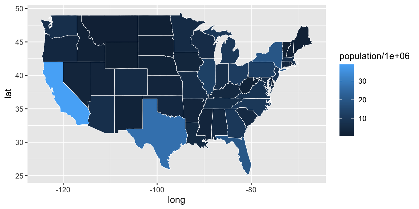
Figure 6.24: A customized choropleth map.
Remarks
Instead of using
population, we usepopulation/1000000. Each state is colored bypopulation size (in millions)to make the legend easier to read.Border color (
white) and line thickness (0.2) are specifically defined within thisgeom.
Once a map is created, it is often helpful to modify color schemes, determine how to address missing values (na.values) and formalize labels. Notice that we assigned the graph a name, p. This is particularly useful as we add new components to the graph.
p <- p + scale_fill_continuous(name = "Population(millions)",
            low = "lightgreen", high = "darkgreen", limits = c(0,40),
            breaks = c(5,10,15,20,25,30,35), na.value = "grey50") +
  labs(title = "State Population in the Mainland United States")
p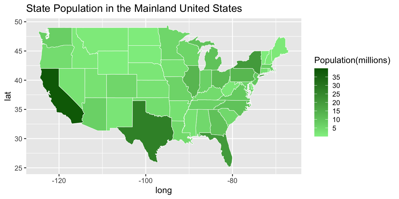
Figure 6.25: A customized choropleth map filled in with green coloor.
It is also possible to overlay two polygon maps. The code below creates county borders with a small line size and then adds a thicker line to represent state borders. The alpha = .3 causes the fill in the state map to be transparent, allowing us to see the county map behind the state map.
AllCounty <- map_data("county")
ggplot() + geom_polygon(data=AllCounty,
                        aes(x = long, y = lat, group = group),
                        color = "darkblue",
                        fill = "lightblue",
                        size = .1 ) +

          geom_polygon(data = MainStates,
                       aes(x = long, y = lat, group = group),
                       color = "black", fill = "lightblue",
                       size = 1, alpha = .3)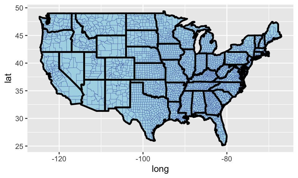
Figure 6.26: A county map.
6.9 Exercises
Plot the
sine(x)andcos(x)curves on the same plot, where \(x\in[-\pi,\pi]\). For the sine curve use a line and for the cosine curve use points.Read in the data from the file
ozone.txt. It contains 78 measurements of ozone concentration in the downtown Los Angeles atmosphere during the summers of 1966 and 1967.- Find the minimum and maximum of ozone data;
- Draw a histogram for the data;
- Draw a boxplot for the data;
- Draw a stem-and-leaf chart for the data.
A medical researcher wishes to determine if a pill has the undesirable side effect of reducing the blood pressure of the user. The study involves recording the initial blood pressures of 15 college-age women. After they use the pill regularly for six months, their blood pressures are again recorded. The researcher wishes to draw inferences about the effect of the pill on blood pressure from the observations given in the following:
               Blood-pressure Measurements Before and After Use of Pill
               --------------------------------------------------------
               Subject     1  2  3  4  5  6  7  8  9 10 11 12 13 14 15
               --------------------------------------------------------
               Before(x)  70 80 72 76 76 76 72 78 82 64 74 92 74 68 84
               After(y)   68 72 62 70 58 66 68 52 64 72 74 60 74 72 74
               --------------------------------------------------------
Draw a scatter plot. Make the x-axis represent the “Before” measurements, and y-axis represent “After” measurements.
- Do the following for the
data(mpg).- Run
ggplot(data = mpg). What do you see? - How many rows are in
mpg? How many columns? - What does the
drvvariable describe? Read the help for?mpgto find out. - Make a scatterplot of
hwyvscyl. - What happens if you make a scatterplot of
classvsdrv? Why is the plot not useful?
- Run